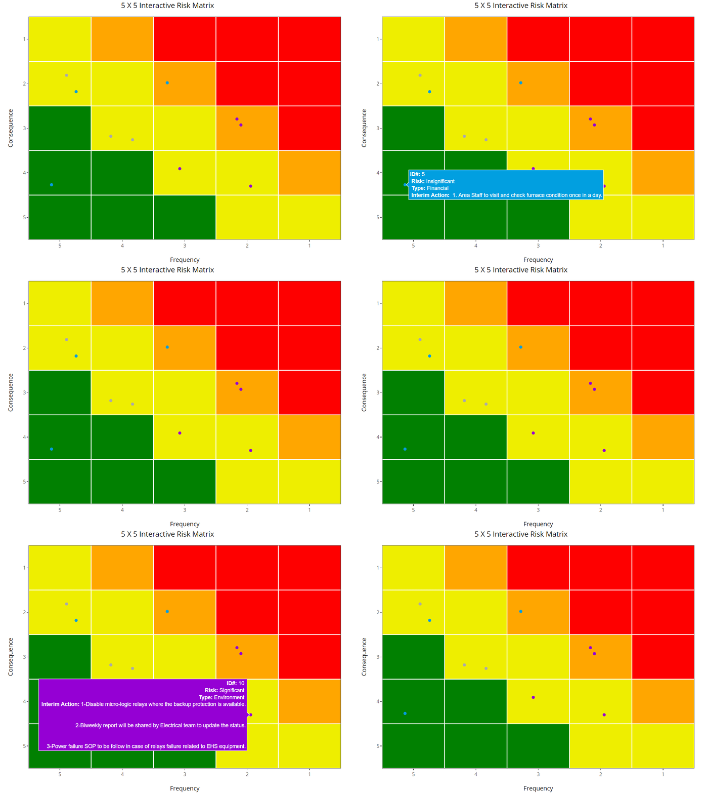
What is Risk Matrix ?
Risk Matrix is an illustration to show the organization risk apatite, and draw the border line (threshold) between risk levels. The green area is where you want your risk to be eventually.
so… risk matrix in the context of this post is a reporting tool.
Sometime the risk matrix is defined as a tool to evaluate risk… and that is a dangerous thing to do, see here
What will we do today
In the this example, the risk matrix is used as a tool to visualize the risk in an interactive way.
I’ll include few fields from the risk register:
- Title
- Risk (Risk Level)
- Type (category of risk)
- Interim (Interim Action)
- Consequence
- Likelihood
Another fields can be:-
- Status
- Control/Mitigation
- Owner
- Event (the description of what could go wrong)
- Date (identification - closure - approval)
- Risk Treatment type (acceptance -transfer - reduce likelihood - reduce consequence)
Code
This work inspired by the work of David Meza
# Load libraries

library(ggplot2)
library(plotly)
library(dplyr)

# Load the data

risk <- read.csv("https://neo-reliability.com/files/risk.csv")

# Creating heatmap background for Risk Matrix

# setting the score in order to calculate the risk level
Likelihood_score <- rep(c(1,2,4,6,12),5)
Consequence_score <- rep(c(1,2,4,6,12),each=5)
Likelihood <- rep(c(1:5),5)
Consequence <- rep(c(1:5),each=5)
df <- data.frame(Likelihood,Consequence)
df <- mutate(df, risk_score = Consequence_score * Likelihood_score,
             Risk = case_when(risk_score >= 0 & risk_score < 6 ~ 1,
                              risk_score >= 6 & risk_score < 12 ~ 2,
                              risk_score >= 12 & risk_score < 32  ~ 3,
                              risk_score >= 32 ~ 4) )


# plotting
risk_p<- ggplot(df,aes(x =Likelihood, y =Consequence, fill=Risk))+
  geom_tile()+
  scale_fill_gradientn(colours = c("red", "orange","#EEEE00","#008000"),guide=FALSE)+
  scale_x_continuous(trans = "reverse",name= "Frequency",breaks = 0:5, expand = c(0, 0))+
  scale_y_continuous(trans = "reverse",name = "Consequence",breaks = 0:5, expand = c(0, 0))+
  #coord_fixed()+
  theme_bw()+
  geom_hline(yintercept = seq(1.5,5.5), color = "white")+
  geom_vline(xintercept = seq(1.5,5.5), color = "white")+
  ggtitle("5 X 5 Interactive Risk Matrix")+
  theme(legend.position="bottom")+
  guides(color=guide_legend(title="Selected Plants"))+
  geom_jitter(data = risk,
              # position = "jitter",
              inherit.aes = FALSE, width= 0.3,height = 0.3,
              aes(y = Consequence,
                  x = Likelihood,
                  col = Type,
                  text = paste("<b>ID#:</b>",ID,"<br>",
                               "<b>Risk:</b>",Risk,"<br>",
                               "<b>Type:</b>",Type,"<br>",
                               "<b>Interim Action:</b>",Interim)))+
  scale_color_manual(values = c("#9400D3","#009fdf","#aaaaaa")
  )

config(ggplotly(risk_p,tooltip = "text", width = 950,height = 750), displayModeBar=FALSE, collaborate = FALSE) %>%
  layout(margin=list(l=90,b=50),
         legend = list(orientation = "h",y = -0.15, x = 0))